 跳到内容

A supermarket checkout is a small area with many visual tasks. Cashiers must read product labels, scan barcodes, see customers and use a point-of-sale (POS) screen. Customers need to understand the counter and payment terminal without looking into a harsh ceiling luminaire. Yet a lighting plan based only on average floor brightness can leave reflections on the screen, shadows across the bagging area and conspicuous glare in the queue.
The solution is not simply “more light.” It is to put useful light on the correct work surfaces while controlling the bright images reflected in displays, polished counters and glass. This guide explains how to review a checkout lighting scheme before purchasing fixtures or repeating a prototype across stores. It does not set a universal lux target or replace local workplace and electrical requirements.
The featured supermarket scene is a concept illustration, not a photograph of an LCB installation.
Why checkout glare is different from aisle glare
In an aisle, shoppers mostly look ahead at shelves and products. At checkout, the cashier repeatedly shifts attention between horizontal items, a near-vertical monitor, a payment terminal and people standing at different positions. A bright luminaire can appear as a reflected stripe on the POS screen even when it looks unobtrusive from the aisle. The same luminaire may cast a shadow from the cashier’s body onto the scanner or bagging zone.
Display coatings and screen angles vary. A glossy monitor can reveal direct reflections more readily than a matte one; a high-brightness screen may mask a problem in a demonstration but still be tiring for long shifts. Review the actual hardware specified for the store. If the counter or POS unit changes late in the project, revisit the lighting arrangement instead of assuming the original ceiling layout remains valid.
Map the cashier’s visual path
Stand where the cashier normally works. Record the positions of the scanner, keyboard or touch display, payment unit, receipt printer, bagging area and customer face. Then walk through a typical transaction and note where the eyes turn. This reveals why a single downlight placed over the center of the counter may fail: one task becomes bright while another is shadowed or reflected.
Repeat the review from the customer’s side. Can the customer see the payment terminal without a bright reflected line? Is the queue route legible without an overlit counter edge? If the checkout supports accessibility needs, consider reach, reading angles and the effect of a seated cashier position. A useful mock-up has to represent more than the standing eye height of the designer.
Put light on products without putting a stripe on the screen
Consider the direction of light leaving each proposed luminaire and where that light is reflected. A linear luminaire directly over or behind a monitor may produce an obvious bright line in the screen. Shifting the luminaire position, changing its orientation, using better shielding or selecting a different optical distribution can reduce that reflection. The answer should be verified from the real viewing angle, not inferred only from a ceiling drawing.
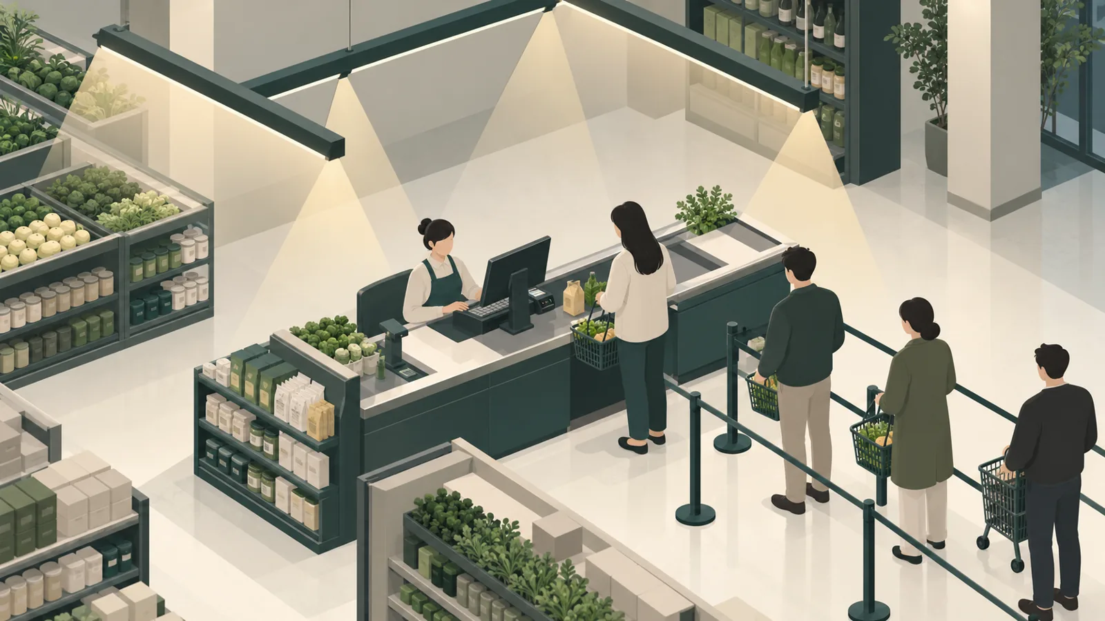
Think about the size and finish of the counter. A light, matte worktop may reveal products well with moderate directed light; a dark glossy surface can show stronger reflections. Highly polished metal scanner surrounds may be distracting. Measure or inspect the task plane, but also look at the image the luminaire creates on the display. These are related but different checks.
If the store uses multiple checkout formats—staffed lanes, express counters and self-checkout—do not use one untested fixture position for all of them. The monitor, customer and scanner geometry changes. Keep a common visual language where possible, but approve a representative mock-up for each distinct layout.
Balance checkout, queue and nearby shelves
The checkout should feel connected to the rest of the store. If it is dramatically brighter than adjacent aisles, customers may see it as harsh. If it is much dimmer, staff may struggle with small print and product handling. Define the visual transitions: approach from an aisle, wait in the queue, place items on the counter and move toward the exit. A good scheme supports each step without sudden bands of brightness.
Nearby shelf or promotional lighting can influence the POS zone. An accent spotlight aimed toward a display beside the counter might reflect off the monitor or the glass on a queue barrier. Check those elements with all layers switched on. Our guide to vertical illuminance on retail shelves explains why shelf visibility needs a different viewpoint from floor readings, but the checkout adds its own monitor and task requirements.
Where shelf lighting is modular, a modular shelf-lighting system may support local merchandise presentation. It should not be treated as the primary answer for the cashier’s task. Separate the design questions: what lights the products, what lights the transaction surface, and what can enter the screen as a bright reflection?
Choose optics and mounting height as a pair
A luminaire’s beam or distribution cannot be judged without mounting height and spacing. A wide luminous surface can give comfortable general light in one arrangement but create a prominent screen reflection in another. A tighter optic may keep light on a task yet create a sharp pool and dark edges. Evaluate the actual counter dimensions and ceiling conditions rather than selecting a product only from a nominal beam angle.
LED linear lights can form clean rows across lanes, and track-mounted luminaires can add flexibility for nearby promotions. For a checkout, ask whether the fixture has appropriate shielding, whether it can be oriented away from critical screens, and whether the output remains visually consistent across adjacent lanes. The linkable linear-light family is one possible architectural starting point; the exact optic and installation must be reviewed for the site.
If the ceiling is low, a fixture’s luminous aperture is more visible from the queue. If the ceiling is high, task delivery and shadow control may become harder. Mock up the proposed mounting position or use credible visualisation and measurements, then inspect the final installation from the cashier’s eye position. A catalogue image cannot show all of these interactions.
Check colour and camera-related performance
Cashiers and customers should be able to recognise packaging and fresh food accurately. Colour quality is more than a single correlated colour temperature. If the checkout sits beside produce or cosmetics, compare samples under the actual approved light source. Our retail colour-metric guide explains why CRI, R9 and TM-30 address different questions. Avoid promising that one metric alone guarantees good appearance for every product.
Some retail systems use cameras or machine-vision equipment near checkout. If that is part of the project, verify the luminaire and driver with the actual camera and its operating mode. Flicker may not be obvious to the eye yet can interact with imaging. The flicker and LED-driver guide can help frame the questions. Do not infer camera compatibility solely from a “flicker-free” label.
Build a representative mock-up before rollout
Install one lane with the planned counter, screen, scanner, payment device and nearby merchandising. Use the intended ceiling finish and actual luminaire positions if possible. Test under normal ambient conditions, not just after closing with every other light switched off. Have a cashier process representative products, including small-print labels and reflective packaging. Ask what is easy to see and where the task feels shadowed.
Photograph reflections from the cashier and customer positions, but do not use camera exposure as the only judgment. Record screen angle, brightness setting and room lighting scene. If an adjustment is made, change one variable at a time—luminaire position, orientation, optic or screen angle—so the team understands why the result improved. Check self-checkout separately if it has a different layout.
For a chain rollout, record the approved sample, fixture variant, mounting dimensions and driver. If sites have different ceilings, identify the conditions under which the prototype may be reused and the conditions that demand a new review. Our retail mock-up approval guide offers a way to document that decision.
A practical checkout lighting checklist
- Show the cashier’s standing and seated viewing positions on the plan.
- Show the POS, payment terminal, scanner and bagging surfaces at their installed angles.
- Check direct view of luminaires and reflected images in each display.
- Inspect merchandise handling for shadows and readable labels.
- Check transitions to queue, nearby shelf and exit lighting.
- Test the approved luminaire, optic, driver and operating scene together.
- Document alternate layouts such as express and self-checkout.
- Retain the mock-up record for later replacement or store expansion.
What to ask a lighting supplier
Send a checkout elevation or photographs, ceiling height, counter dimensions, screen model and the intended store lighting layers. Ask the supplier which optic and mounting arrangement they propose, and how they will verify screen reflections. Request a sample when the project is significant or repeated across branches. If the fixture is customised, approve the mechanical format, output, colour and driver before ordering at scale.
Suppliers can propose candidate commercial LED fixtures, but the project team must verify the final lighting design, electrical installation and applicable rules. The most useful quotation is one that states the assumptions clearly. A promise of “no glare” without the actual screen and viewing geometry is not a reliable specification.
Plan for maintenance at the checkout
Checkout lanes are rearranged, screens are replaced and promotional stands appear beside the queue. Each change can move a reflective surface into a beam that was previously harmless. Give store staff a simple way to report a new reflection and tell the maintenance team which fixture positions and screen angles were approved. After a POS upgrade, repeat the seated and standing screen-view check before blaming the luminaire itself.
Cleaning is another practical issue. Dust on a lens or diffuser can alter the appearance of a continuous light line, while a replacement driver may dim differently from the original. Record the approved fixture and driver combination in the store maintenance file. If the retailer has dozens of similar lanes, keep one reference lane or photographic mock-up record so small substitutions do not produce a patchwork of colour and brightness across branches. The goal is repeatable visibility, not merely a successful first installation.
Frequently asked questions
Is a brighter checkout always easier for cashiers?
No. More light can improve some tasks but also increase screen reflections and contrast. Put appropriate light on work surfaces and inspect the whole visual path.
Can changing the POS screen angle solve the problem?
It can help, but it may create a poor ergonomic position. Evaluate screen angle, luminaire location and optic together rather than shifting the display solely to hide a reflection.
Should all checkout lanes use the same luminaire?
They may share a product family, but different lane geometries and ceiling conditions may need different positions or optics. Prototype representative layouts.
Does a low UGR value guarantee no screen glare?
No. Room-based glare assessments and screen reflections are different checks. The actual display, viewing angle and luminaire location must be reviewed.
What should be recorded after the mock-up?
Fixture and driver variant, mounting geometry, screen model and angle, operating scene, observations from cashier and customer viewpoints, and any approved changes.
For a supermarket or multi-store project, LCB can review the checkout layout alongside the broader aisle and shelf-lighting scheme. Share the plan, POS details and photographs of a representative lane so fixture options can be evaluated against the real task.
