 跳到内容
跳到内容 
Two LEDs can both be labelled CRI 90 and make the same red fabric, skin tone or food package look noticeably different. That does not mean CRI is useless. It means one average number cannot describe every aspect of colour rendition. Retail buyers need to connect metrics with the merchandise, brand palette and visual decision their customers make.
This guide explains CRI, R9 and the TM-30 framework in practical language. It helps designers and procurement teams write a specification, compare samples and avoid paying for a premium label that does not improve the store.
Start with the customer’s colour task
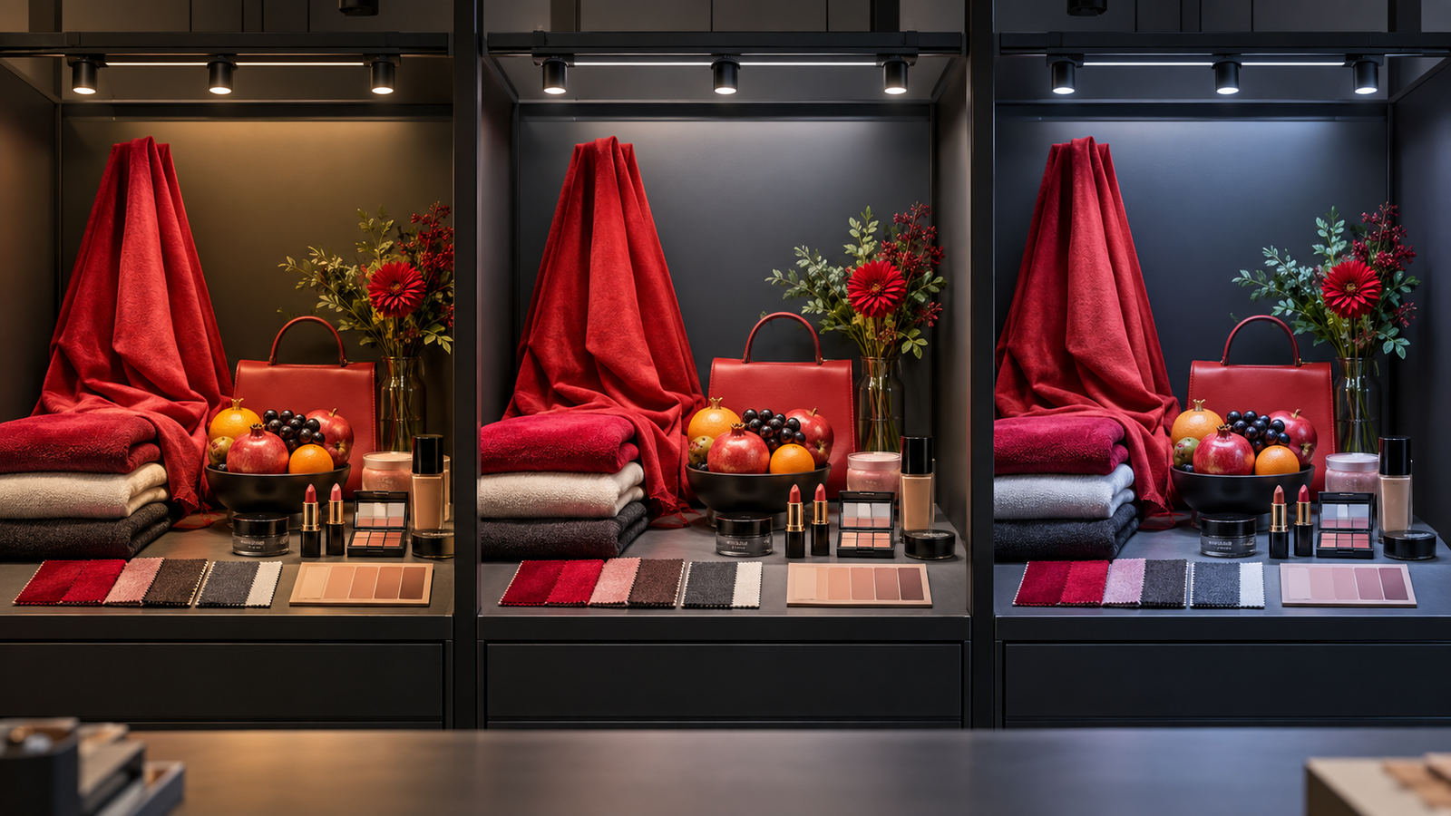
A fashion customer needs to distinguish navy from black and judge skin tones in a fitting area. A supermarket needs meat, fruit, bakery and packaging to appear attractive without becoming misleading. A cosmetics store needs subtle reds and skin tones. A furniture showroom needs timber, stone, paint and fabric to remain believable together.
Write these visual tasks before selecting a number. Photograph or collect representative samples, including difficult colours. The best metric set depends on the application and acceptable trade-offs between fidelity, saturation, efficiency and brand appearance.
What general CRI Ra measures
The general Colour Rendering Index, usually written CRI or Ra, compares the appearance of a set of test colours under a test source with a reference illuminant. It is expressed on a scale commonly shown up to 100. A higher value generally indicates closer average fidelity for the samples used in the calculation.
Ra is widely used in regulations, standards and product specifications. It remains useful for screening and communication, but it is an average based on a limited sample set. It does not reveal which colours are weak, whether saturation has shifted, or how a modern LED spectrum affects a larger range of real materials.
Why two CRI 90 sources can look different
An average can hide individual results. A source may score well on the test colours included in Ra while rendering a vivid red or saturated brand colour less accurately. Spectral power distributions can differ substantially even when CCT and Ra are similar.
Optics, surrounding surfaces, adaptation and contrast also affect perception. The LED metric is only one part of the scene. A CRI 90 spotlight aimed badly or mixed with inconsistent colour temperatures may create a worse customer experience than a carefully coordinated system.
What R9 tells you
R9 is a special colour rendering index associated with a strong red test colour. It is not included in the average Ra calculation. Red rendition matters for skin, meat, warm timber, red textiles, cosmetics and many brand colours, so buyers often specify both Ra and a minimum R9.
R9 is still only one sample. A strong R9 does not guarantee excellent rendering of every saturated colour, and an isolated number does not explain hue or saturation shifts. Use it as an application-relevant supplement, not a replacement for a broader evaluation.
What TM-30 adds
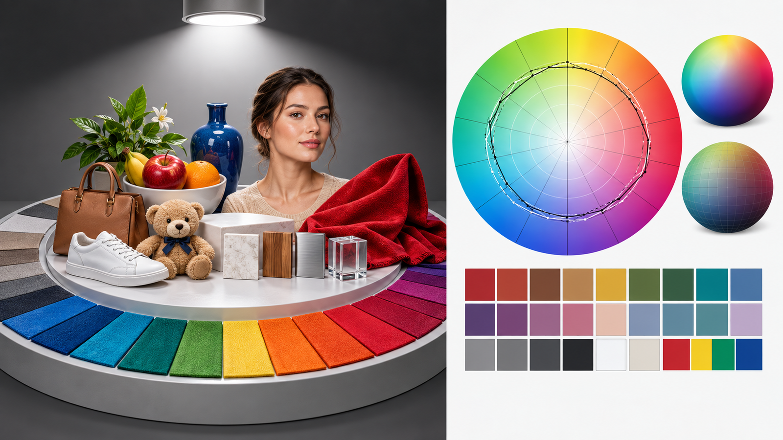
IES TM-30 evaluates colour rendition using a much larger set of colour evaluation samples and reports multiple aspects rather than one average. Two headline measures are fidelity and gamut. Fidelity describes overall similarity to the reference, while gamut indicates whether colours are, on average, more or less saturated. A colour vector graphic shows how hue and saturation shifts vary around the colour space.
This richer view helps a retail designer see whether a source with acceptable fidelity increases some colours, reduces others or creates a particular hue shift. It is especially useful when comparing LEDs that have similar Ra but different spectra.
Rf is not simply “the new CRI number”
The fidelity index used in newer methods is calculated differently from traditional Ra and uses different samples. Values should not be compared as if they were identical scales from the same formula. A product may have a familiar CRI value and a different Rf value without either report being fraudulent.
The CIE’s 2025 position statement recommends that the lighting community begin adopting the CIE general colour fidelity index Rf and report both the established and newer metrics in parallel during transition. Buyers can therefore request Ra, R9 and a contemporary fidelity or TM-30 report when colour decisions justify it.
Fidelity and preference are not the same
High fidelity means colours resemble their appearance under the chosen reference. Customers may sometimes prefer slightly increased saturation, especially in merchandising, but stronger is not always better. Oversaturation can make products look unnatural or create disappointment when they are viewed elsewhere.
Decide whether the brand wants faithful appearance, a controlled enhancement or different strategies by department. A supermarket fresh-food zone and a fashion fitting room should not automatically share the same spectral choice.
CCT must be controlled separately
Correlated colour temperature describes the warm-to-cool appearance of nominally white light. It does not measure colour rendition. A 3000 K source and a 4000 K source can both have high CRI while creating different ambience and material appearance.
Select CCT around the space, finishes, daylight, merchandise and brand. Then compare colour quality within that CCT family. Mixing several CCTs accidentally across one sightline can be more distracting than a modest difference in CRI.
Colour consistency matters across luminaires
A beautiful sample is not enough if production units vary visibly. Ask for chromaticity tolerance, SDCM or MacAdam ellipse information and batch-control method. Review consistency between luminaires, between panels of a dual-panel product and across repeat orders.
For continuous linear runs or white ceilings, small differences can be easy to see. For adjustable retail lighting, mismatched pools may make merchandise appear inconsistent. Keep approved colour data and a reference sample.
Spectrum can affect efficiency
Improving colour quality can involve an efficacy trade-off. A higher-CRI or stronger-red spectrum may produce fewer lumens per watt than a standard option, depending on the LED design. Compare complete-luminaire performance for the exact CCT and colour option rather than applying a generic lumen figure to every version.
Useful light on the merchandise matters more than maximum catalogue efficacy. A slightly lower lumen output with better colour and controlled optics may deliver greater retail value, but the project should quantify energy and lighting results.
How to specify colour quality by application
Fashion and textiles
Prioritise reliable differentiation of dark colours, reds, skin and fabric textures. CRI 90 can be a starting screen; add R9 and a broader colour report for important spaces. Test the actual seasonal palette.
Food retail
Evaluate red meat, produce, bakery, chilled packaging and white materials separately. Avoid a spectrum that enhances one department while making another unnatural. Department-specific solutions may be justified.
Cosmetics and beauty
Skin tones, reds and subtle hue differences are central. Use representative skin-tone samples and products at customer viewing distance. Check mirrors and mixed daylight.
Furniture and materials
Test timber, stone, metal, paint, leather and textiles together. Fidelity and metamerism can matter when customers take samples home to different light.
General supermarket aisles
Consistency, label readability and balanced appearance may matter more than premium colour enhancement. Set a sensible baseline and reserve specialised spectra for zones where they provide value.
Sample comparison method
- Use the same CCT, illuminance and beam geometry for each source.
- Allow adaptation and avoid mixing the samples in one field of view when judging individually.
- Include real merchandise, skin-tone references and difficult brand colours.
- Record Ra, R9, Rf, gamut and vector data available for each source.
- Invite design, merchandising and technical stakeholders to score the same criteria.
- Repeat observations at typical customer distance and with surrounding finishes.
- Photograph consistently, while recognising that cameras do not reproduce vision perfectly.
- Retain the approved LED code, spectrum report and golden sample.
Questions to ask the supplier
- Are the colour metrics measured for the exact CCT and LED option?
- What are Ra, R9 and the available TM-30 or CIE fidelity results?
- Can you provide the spectral power distribution?
- What colour-consistency tolerance is supplied?
- How are both panels or modules matched?
- Does the high-CRI option change lumen output or wattage?
- Which LED manufacturer and code are locked for production?
- How will repeat orders be controlled?
- What test report and laboratory measured the sample?
- What component changes require buyer approval?
How a dual-panel track light should be evaluated
For a dual-panel luminaire, compare the two panels on the same white and coloured targets. Independent aiming can place the panels on different surfaces, making a mismatch more noticeable. Measure or visually inspect both before accepting the sample.
The LL1615 adjustable dual-panel LED track light offers CRI above 80 or 90 options. Select the option according to merchandise and project value, then lock the exact LED and CCT in the production specification. Do not infer advanced colour metrics unless the selected configuration has corresponding data.
What to put in the purchase order
State CCT, CRI Ra minimum, R9 minimum if relevant, any Rf or TM-30 targets, chromaticity tolerance, lumen basis, approved LED code, report reference and allowed production tolerance. Define sample approval and change notification. Attach a photograph or list of representative merchandise used in the mock-up.
Our RFQ and sample-approval guide helps keep these values connected to the driver, optic and fixture configuration.
Final recommendation
Use CRI as a starting language, R9 as an application-specific check for red, and broader colour-fidelity and gamut information when merchandise colour affects buying decisions. Then verify the numbers with a controlled mock-up. Metrics should help you see risk, not replace seeing the products.
If you send us your CCT, merchandise type, target colour metrics and sample materials, we can prepare a comparison around the actual decision. We prefer to show what each option changes in colour, output and cost instead of declaring one universal “best CRI.”

